Do you miss travel? Maybe feeling a little nostalgic? Join the club. While we may not be able to travel much right now let’s take a trip down memory lane and enjoy some of the best vintage airline logos ever created.
Vintage Airline Logos
Lately, I’ve been watching a lot of the popular History Channel show American Pickers (arguably the best show on TV…) and in one of the episodes the guys picked some airplane antiques. It got me thinking about the good old days of air travel and feeling a little nostalgic, and while I am too young to have experienced air travel before the seventies, some of the best advertising and logos of all time were created – including in the airline industry.
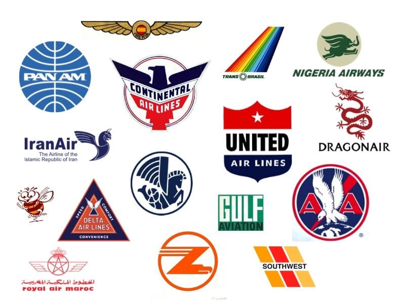
I went digging for old airplane logos and have highlighted some of my favorites. Some are from airlines still in service today (like United) while others are from now defunct airlines. They may be gone, but their logo lives on forever.
I hope you enjoy this trip down memory lane as we bring you some of the best vintage airline logos of all time.
United Airlines 1940 – 1954
United Airlines was first incarnated as Varney Airlines in 1926. Later the name was changed to United Airlines in the 30’s. Ironically, Walter Varney also formed the company (Varney Speed Lines) that would become Continental Airlines, which was purchased by United in 2010.
This iconic airliner has ferried passengers all over the world and over their many years of existence have used numerous logos. My favorite, however, is the one used in during the 40s and 50’s. This logo, pictured below, reflects all of the incredible design elements so popular in this time frame.

Image sourced from Fandom
You can see a picture of the original Varney Airlines logo here.
Current United Airlines Logo (2019 to present)
The current United Airlines logo, below, is just ok, and while it reflects the heritage of both United and Continental, it’s just doesn’t compare to some of it’s predecessors, including the one incarnated in the 40’s.

Continental Airlines Logo 1937 – 1960
This Continental Airlines logos that served as their logo from the late 30’s through 1960 is arguably the best of the bunch. It’s certainly my favorite airline logo of all time.
Continental, of course, is now part of United Airlines, and ironically was started by the same person who formed what became United Airlines (William Varney).
We love this incredible logo that features striking lines, bold patriotic colors, and art deco era fonts and design elements.

Image from Fandom
Continental’s last logo before being absorbed by United is pictured below:

American Airlines 1930 – 1945
In general, the American Airlines logos over the years really don’t do anything for me. Arguably, the best of the bunch is the one they used in the 30’s and part of the 40’s and pictured below.
Image from Fandom
TWA Logos 30s & 40’s
TWA is an iconic airline in American aviation history. Formed in 1930 and eventually owned by Howard Hughes, the airline had a variety of logos over the years, but the one pictured below is probably the best of the bunch. The now defunct airline was acquired by American Airlines after 9/11, but shares a nostalgic place in American aviation lore.
Image from Fandom
We are also big fans of this version as well:

Delta Airlines circa 1935
Another classic American airline is, of course, Delta Airlines. Delta, officially incorporated in 1928, started in the crop dusting business, later moving into transportation of passengers and cargo.
Over the years they’ve changed logos many times including several classics, but my favorite is this one from around 1935, and pictured below.
Image from Fandom
We also love the logo they used in the 50s and which oozes 50’s culture and vibe:
The current Delta logo is here.
Hawaiian Airlines ~1940’s / 1952 / 1966
We are not fans of the Hawaiian Airlines logo since it started incorporating a flower theme into it (although we can certainly appreciate why they’ve went in that direction). For our money, their best logos were their early ones – specifically the one used in the 1940’s and the super cool and streamlined one used in the mid 60’s (although they could have dropped the “safety record” claim).
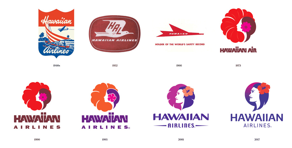
Image from Under Consideration
Southwest Airlines
Southwest is probably my favorite airline and their logos over the years are pretty interesting too. What’s interesting about the early logo is its simplicity. The stripes and a bold font. Nothing fancy. It also reflects the era of the late 60’s and 70’s colors…that ugly orange which I just love.
1967 – 1971

1971 – 1998
We see the entry of the famous Southwest heart and the iconic Southwest blue into the log in the seventies and we dig it!
Nigeria Airways
The now defunct Nigeria Airways was formed in the 50’s and ultimately ceased operations in 200. We love this fun logo that shows a elephant with wings for ears. The whimsical nature of the logo coupled with the super cool green color theme makes it one of my favorites.

Image from Seeklogo
Qantas Airlines 1947 – 1968
If Kangaroos could fly they’d look like the Qantas logo which has undergone a number of revisions over the years, most of which still reflect some variation of a winged kangaroo. Even the current logo includes a kangaroo although it is must less difficult to clearly see it.
We are particularly partial the logo used by the airline from the late 40’s to late 60’s and pictured below.

Image from Fandom
Busy Bee Airlines 1966 – 1992
Busy Bee Airlines was a Norwegian airline with a fun logo. They didn’t own many planes, but they did have a pretty cool logo. The airline ceased operations in the early 90’s.

Image from Wikipedia
Zambia Airways Logo
Zambia Airways’ logo is in my top 3 airline logos of all time. This defunct airline ceased operations in 1994, but served as the Zambian national carrier since the 70’s.
This logo reflects all off the glitz and glamour of the early days of the aviation industry with distinctive traces of art deco. The clever use of the letter z that doubles as a bird is some of the most clever logo-work we’ve seen.
Finally, the bright orange makes quite the “pop” of color helping to make this one logo one of my favorites.
Zambia Airlines is slated for a relaunch, but it appears a variety of challenges have set it back, including the COVID pandemic.

Image from logovaults
Trans Brasil Logo
Trans Brasil was ahead of its time with the logo it used in the 70’s. This troubled airline started in the 50’s and ultimately fizzed out in 2001. It’s iconic logo is a must have on any vintage airline logos list and we like it to.

Image from Pinterest
Iran Air 1979 – Present
Say what you will about the oppressive Iranian regime, but the logo of their flagship airline is pretty cool. The logo is inspired by the mythical Persian Griffin – an eagle / lion mashup.

Air France 1933 – 1976
We are so confused by the Air France logo….it’s simultaneously awesome and confusing. It’s like a flying horse / mermaid / wi-fi signal.
In reality, the Air France logo has its roots in ancient Greek mythology and is, in essence, a hippocampus, or winged sea horse.
The hippocampus played a role in the Air France logo for many years and several variations, however it is absent from the most recent logo. Originally, this logo came from another French airline, Air Orient, which was merged into Air France back in the 70’s.

Image from Fandom
Dragon Air 1985 – 2016
Dragon Air is owned by Cathay Pacific and from 1985 to 2016 this Hong Kong airline had one of the coolest airline logos of all time. The iconic red dragon with a font choice reflective of the culture is striking and one of my favorite logos.

Image from Fandom
Royal Air Maroc 1957 – 2008
This Moroccan airline was formed in the late 50’s and featured a striking red logo with a winged pentagram and crown. Pretty cool. The current logo is more or less the same logo with some smoother lines.
Image from Fandom
Iberia 1939 – 1941
Spanish airliner Iberia Airlines continues to operate today and while it’s current logo is vastly different than our favorite, pictured below, this iconic brand still lives on today despite a merger with British Airways in 2010.
We love their second logo, below, which was used for a few years in the late 30’s and early 40’s.

Image from Fandom
Gulf Aviation 1970 -1973
Today, Gulf Aviation is known as Gulf Air, but it’s roots were as Gulf Aviation. This Bahrain based airliner has a far different logo than its first logo, pictured below. The original logo has a petroliana vibe too it and feels more like something you’d see on an old service station. We love it.
Image from Fandom
Pan Am 1973 – 1991
Closing out our list of vintage airline logos is the Pan Am logo used from the 70’s to early 90’s. Oddly, while Pan Am has a special place in aviation history, it’s logos really aren’t that iconic – at least in this humble bloggers opinion. The best of them is pictured below:

Image from Fandom
Final thoughts on vintage airline logos
How about you? What vintage airline logo did we forget to include in our list? Of course, this is always subjective…but I think we’ve got a pretty good list. Drop us a comment or tweet us your favorite logo!
Pin me for later:
Affiliate Disclosure: As an Amazon Associate I earn from qualifying purchases. I may also earn commissions from other affiliate programs as applicable.

2 comments
Please don’t tie the Iran Air logo to the current regime. This logo has been around since the inception of Iran Air, way before the disastrous 1979 revolution. It’s a logo of the Persian Osprey statues found at the ruins of Persepolis. Please do a little research before making inaccurate comments. Look up old vintage Iran Air ads from the good old days of the Shah who created the Airline.
Thanks
Eastern had a pretty cool logo as well. I find the Continental logo you show to look kind of dark and authoritarian. The first Hawaiian logo from the ’40’s is great. I know it’s not your thing but I really like the Pan Am logo a lot but I’m likely biased since it’s still my all time favorite airline.